

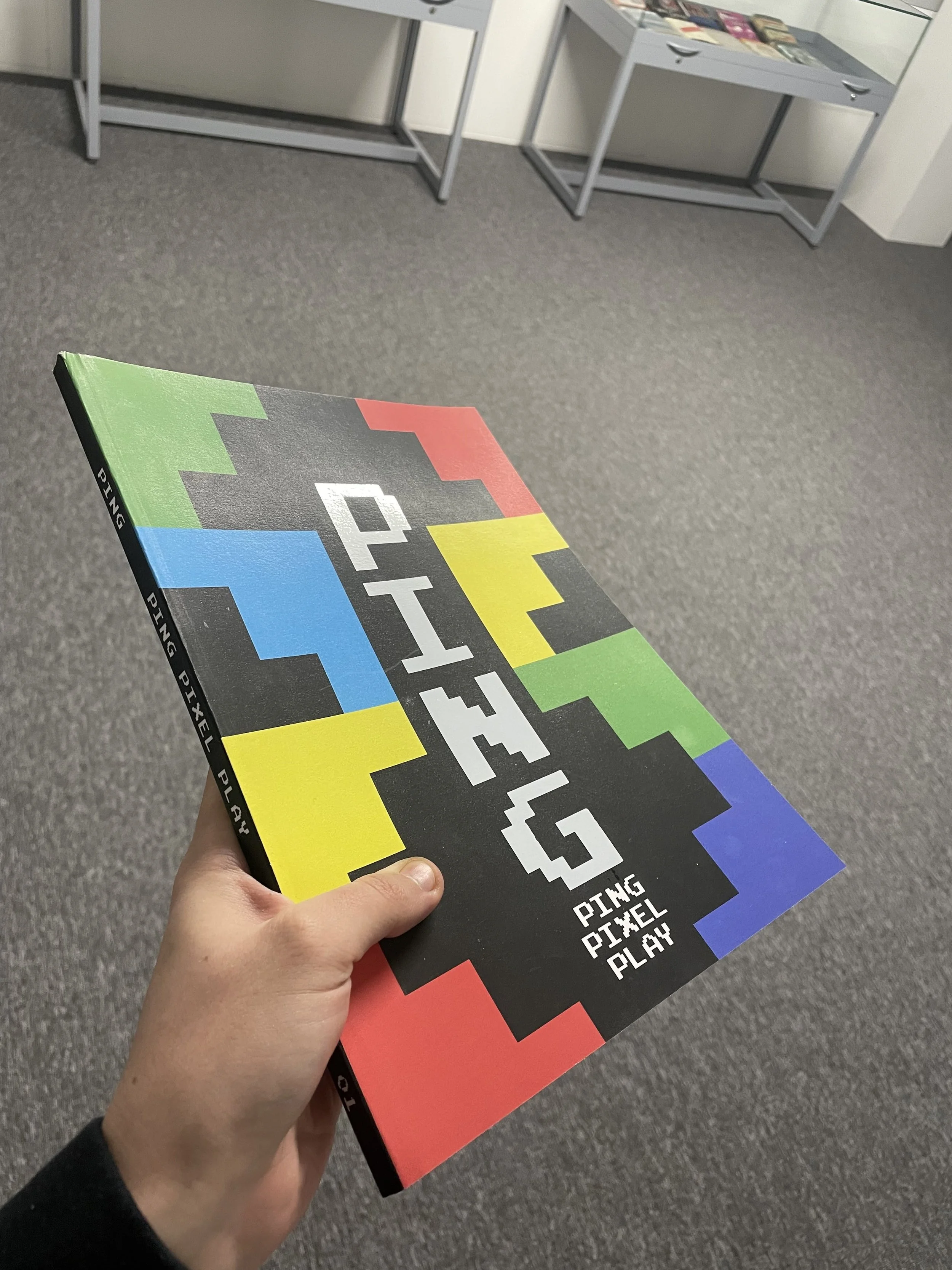
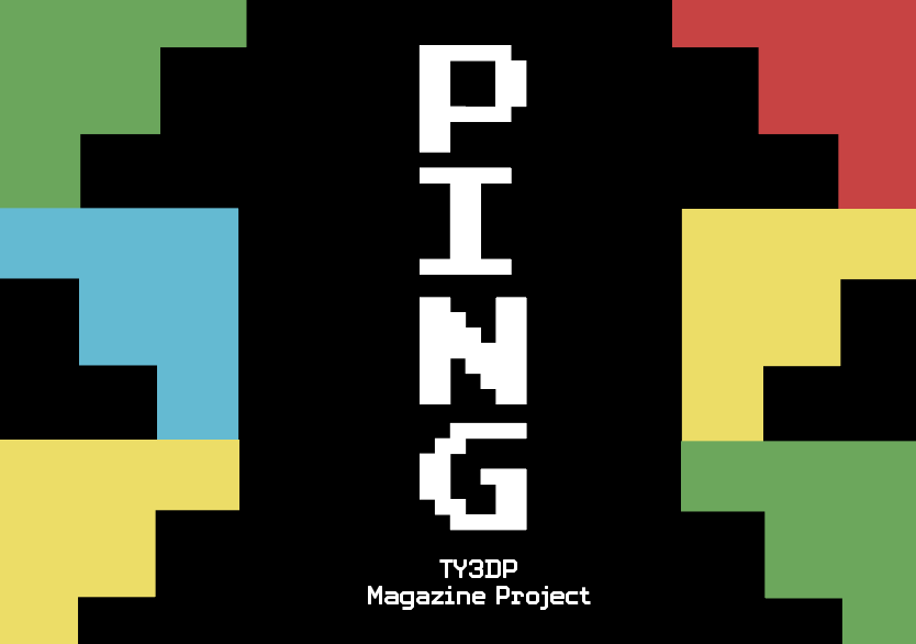
PING publication using white foiling as a finish referencing the reflective qualities of CRT screens
PING
PING is an independent gaming magazine spreading across three issues depicting the evolution of gaming culture from early classic arcade games such as Pac-Man and Space Invaders.
This specific subject was important to me as gaming culture is expanding worldwide and with the advance of technology gaming is revolutionising the creative industry especially in film and animation.

Signature by
Luna Yacoub
Inspiration
Before designing the magazine itself, it was important to understand how real life magazines are showcased in public and to understand the difference between an independent magazine and a commercial magazine as they both have different scopes with visual storytelling to an audience. A primary example would be when I visited the Clarence street magazine shop where there were many commercial based magazine publications. If we compare this to A profound waste of time, they focus on a primary scope which is targeted to users that enjoy illustration and it’s more personal. This website was extremely helpful in giving me inspiration with how to structurally design playful pages for a younger audience as my topic is on gaming culture. In addition, the issues shown had publications that had different finishes which include a spot colour and uv finish. This is helpful to understand the market position as users are most likely to buy a magazine if it is appealing at first glance, thus this was taken in consideration.
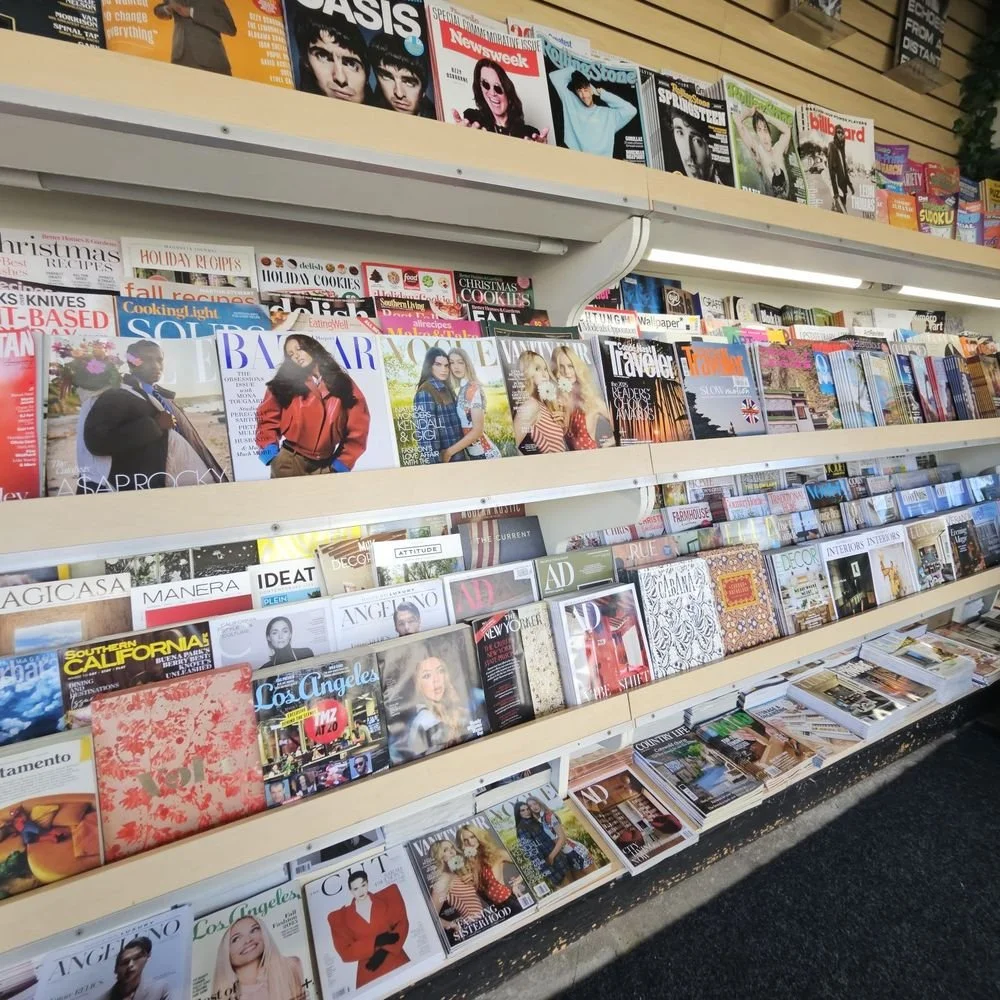

Clarence Street Magazine
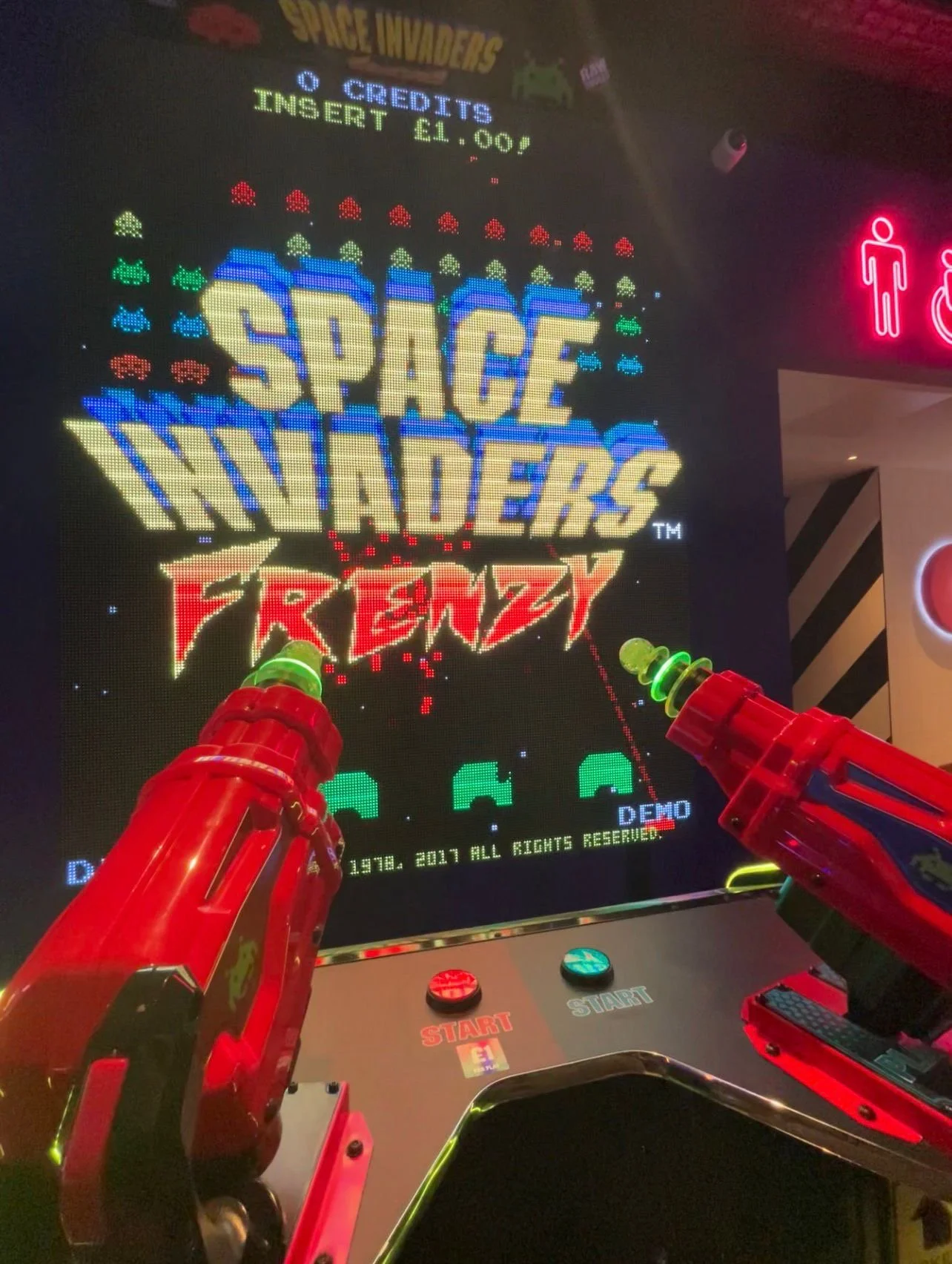
Hollywood Arcade visit
Ideation
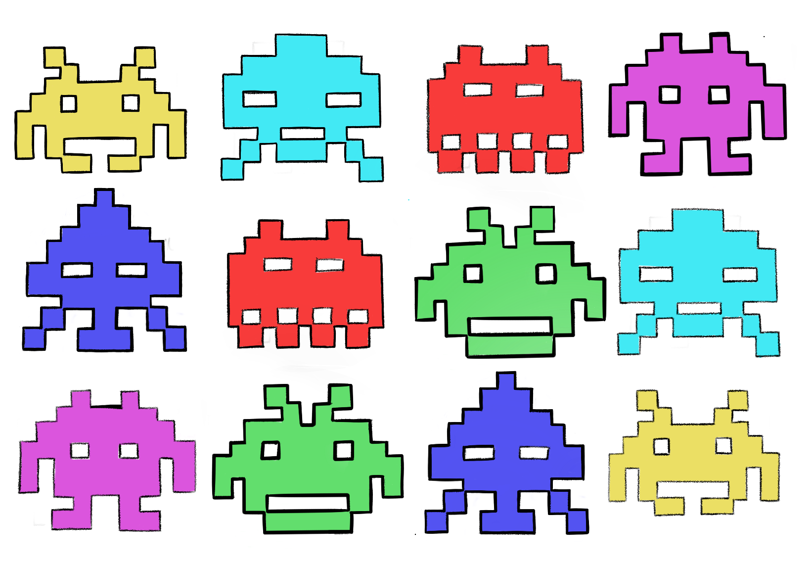
These are different concepts of gaming presented e.g through devices, arcade screens or the games in itself.
Through constructing these ideas, I experimented with using different typefaces that have characteristics referencing the design of characters or landscapes in early arcade games. QuizShow1976 was a typeface I decided to go with after looking at a variety of different ones as the typeface belongs to the Toshi Omagari Arcade Game Typography family an d. It was a 1970’s recreation of the “Atari Quiz Show” as Toshi has emphasised. Acknowledging this information impacted my research with type design as it was utilised as my masthead. The elongated letterforms with blocky counters emphasises the origins of arcade gaming as characters like space invaders have a a similar design. Therefore, this was adapted to use throughout the magazine.
Furthermore, the idea of the word PING as the name for the publication was because ping means multiple things within gaming culture. Although ping means the time for data to travel to a game server, it also means updates, or reflects the sound coming from a ping and all these references I thought ties well within gaming and explaining about it.
Check out my workfile on the design process of the layouts for chapter openers, short/long article layouts, event listings, contents, editors note and more!
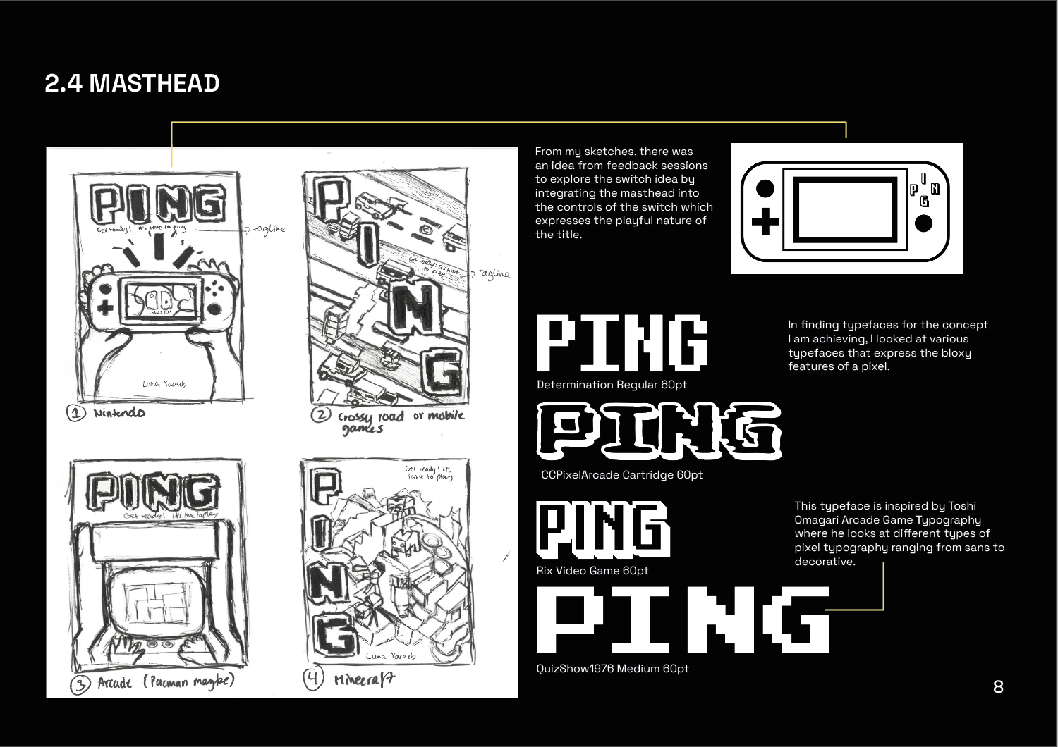
Masthead ideas
Toshi Omagari Arcade Game Typography

Magazine Workfile
Result
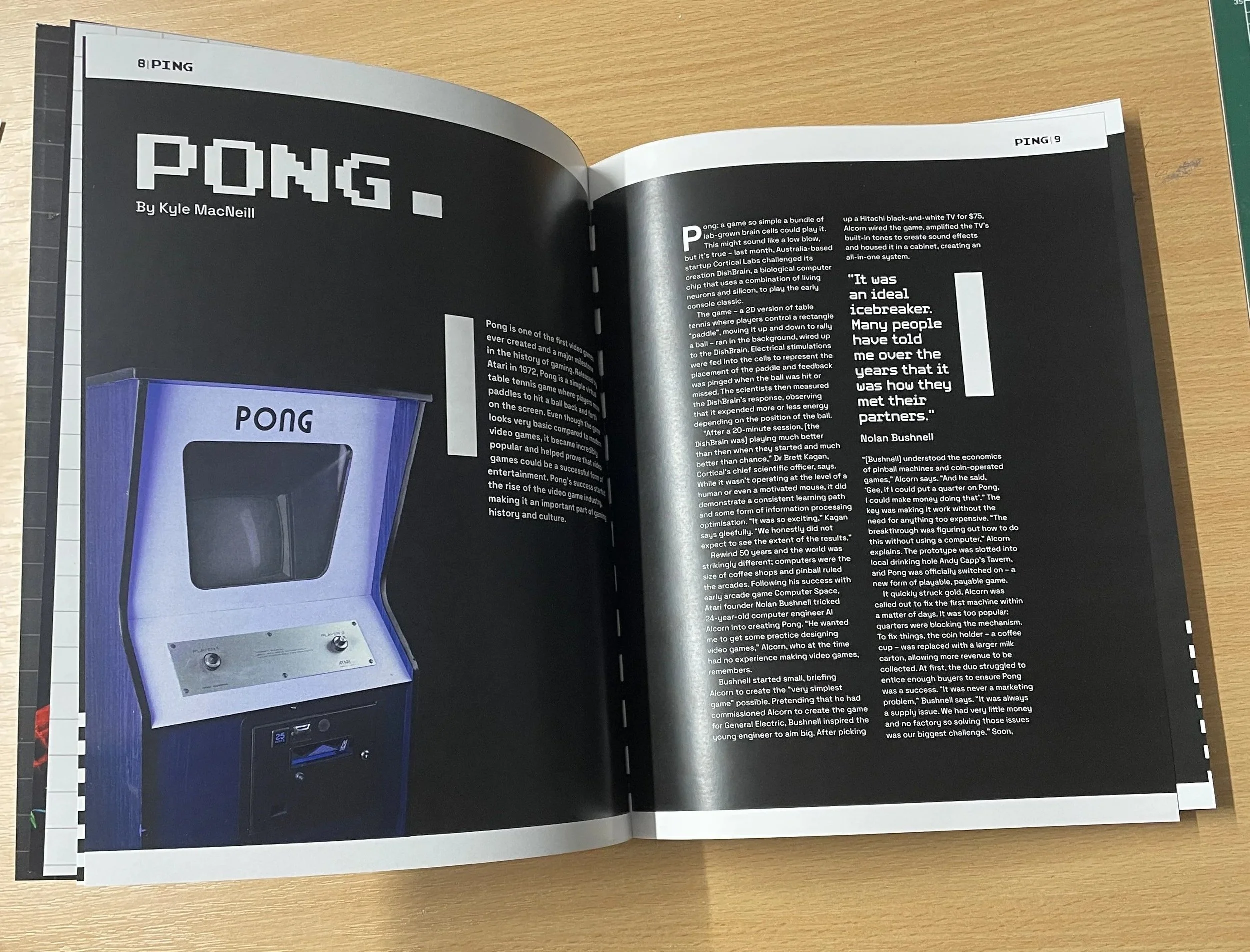
PONG: long article using the bats playfully around the text to reinact the motion
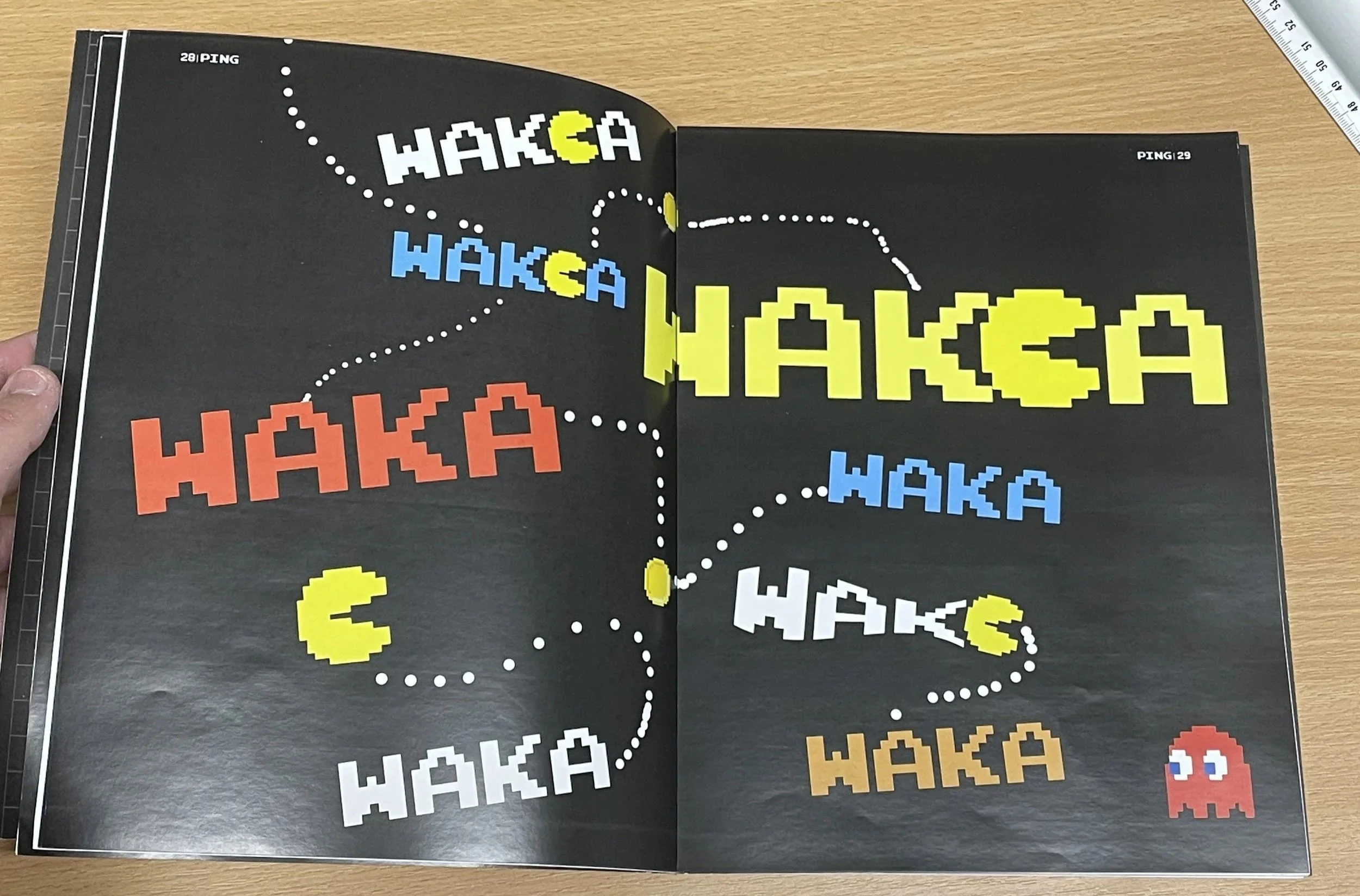
Typographic spread of Pacman